
crawling panther . tattoo


logo
client name
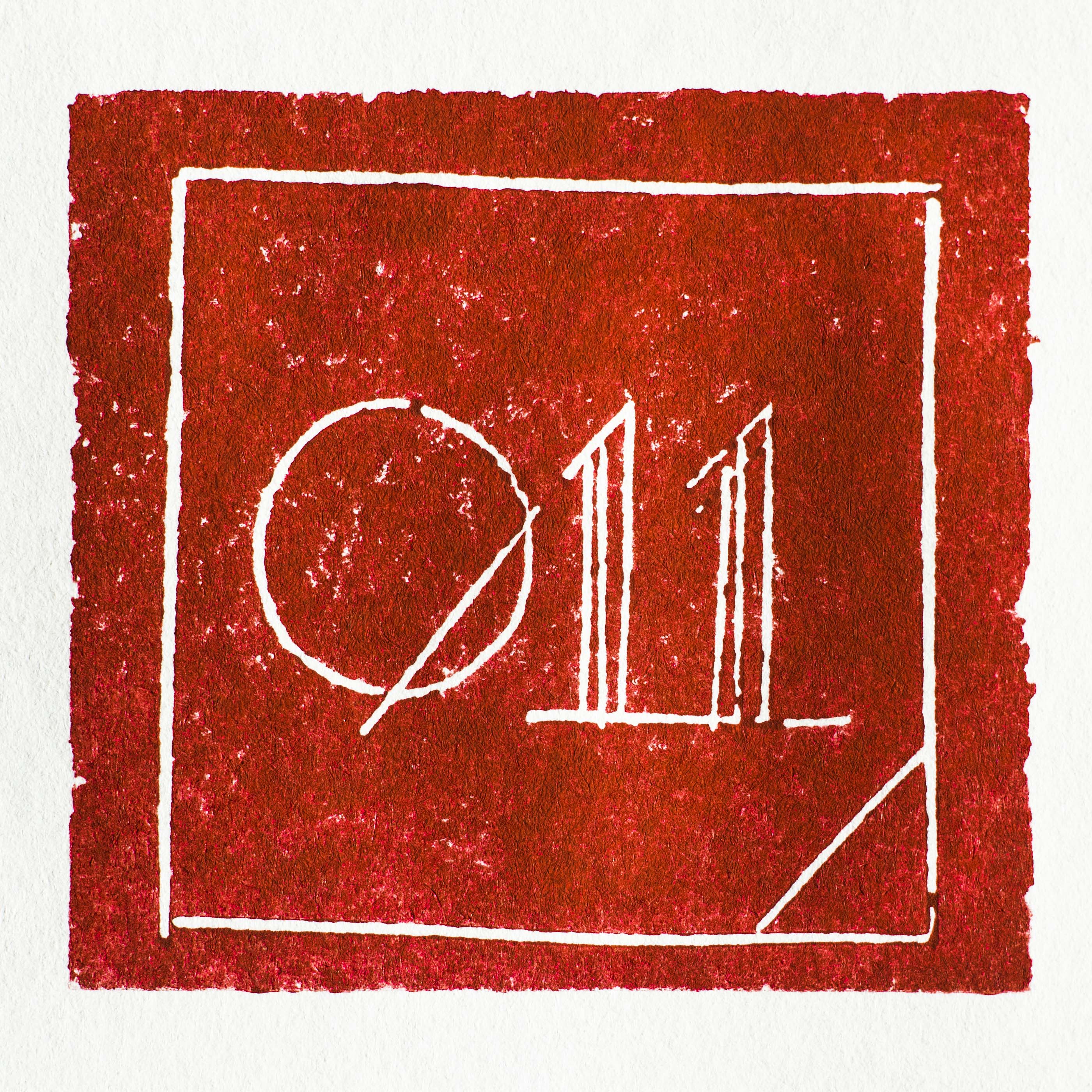
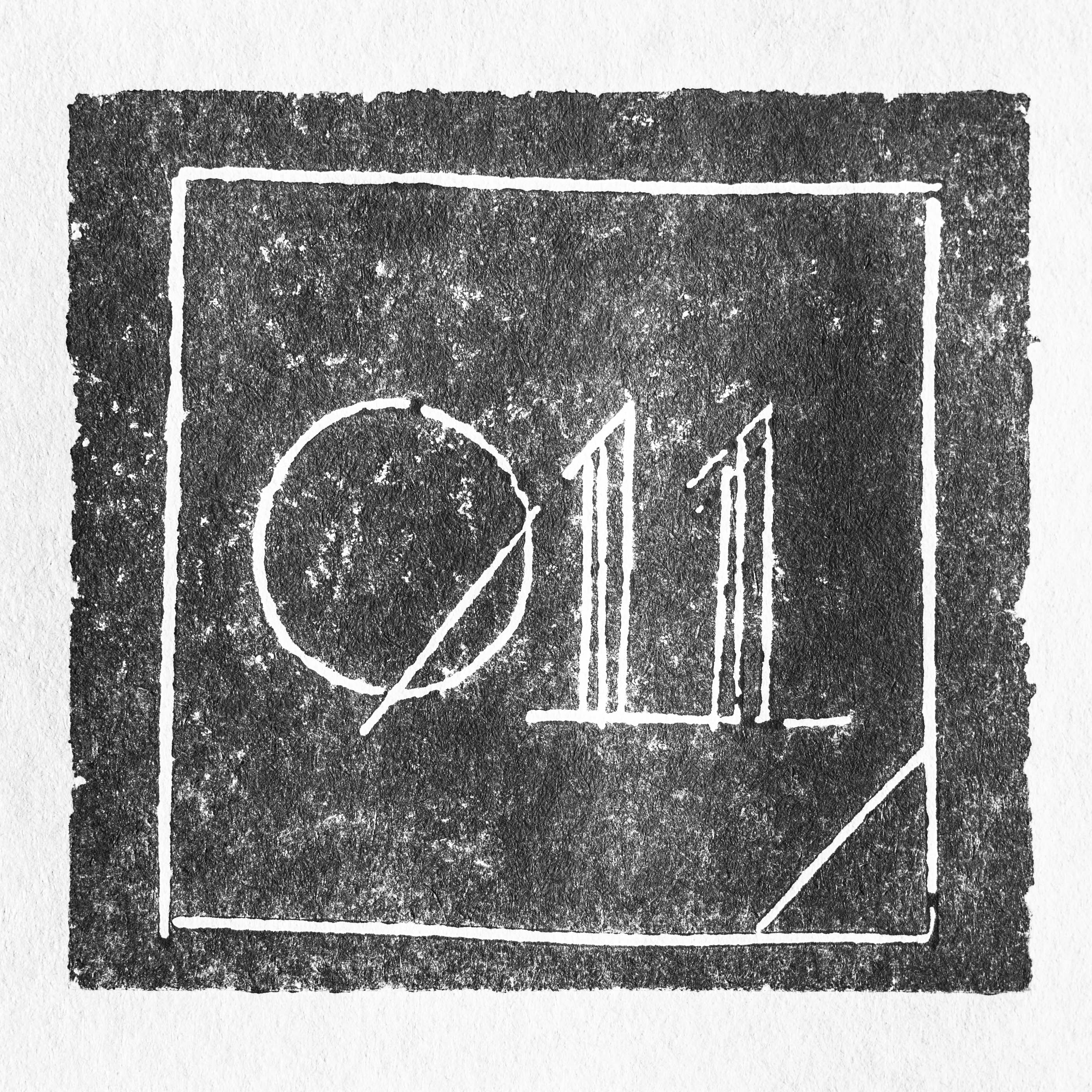
011 Association
my role
concept . design
the objective
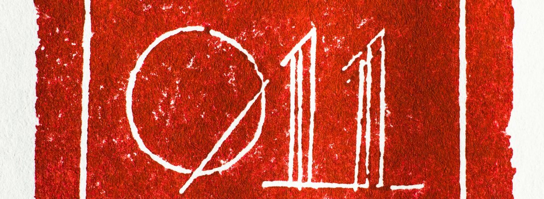
A cultural association. The square, triangle and circle were the baseline, inspired on Wassily Kandinsky’s theory of form.
A linoleum was carved and then the impression photographed.

album artwork


client name
César Oliveira
my role
concept . design . photography . illustration . art director
the objective
This album was a reinterpretation of the music from the middle ages, in Portugal. I had total freedom, the client had no request. I chose to use an artwork pen, with sepia do to all the drawing and lettering, with the gold and violet, associated to the illuminated manuscript, as well as the “s” with that particular shape. The pattern was also a inspiration from the fabrics used back then. Then I photographed the all thing, making sure I let those nuances from the sepia stand out.

photograph
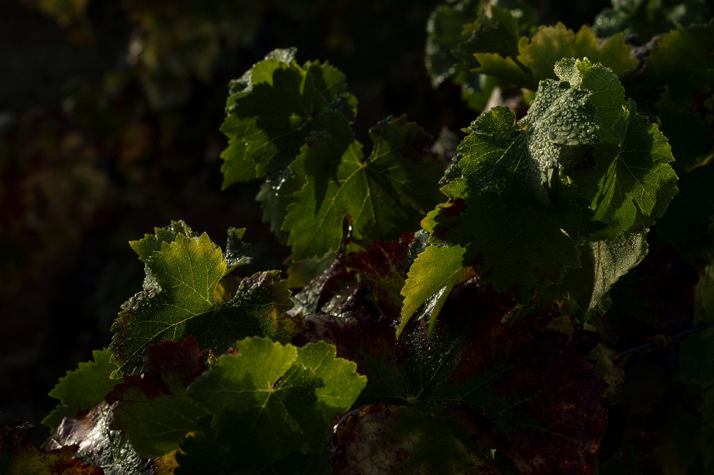
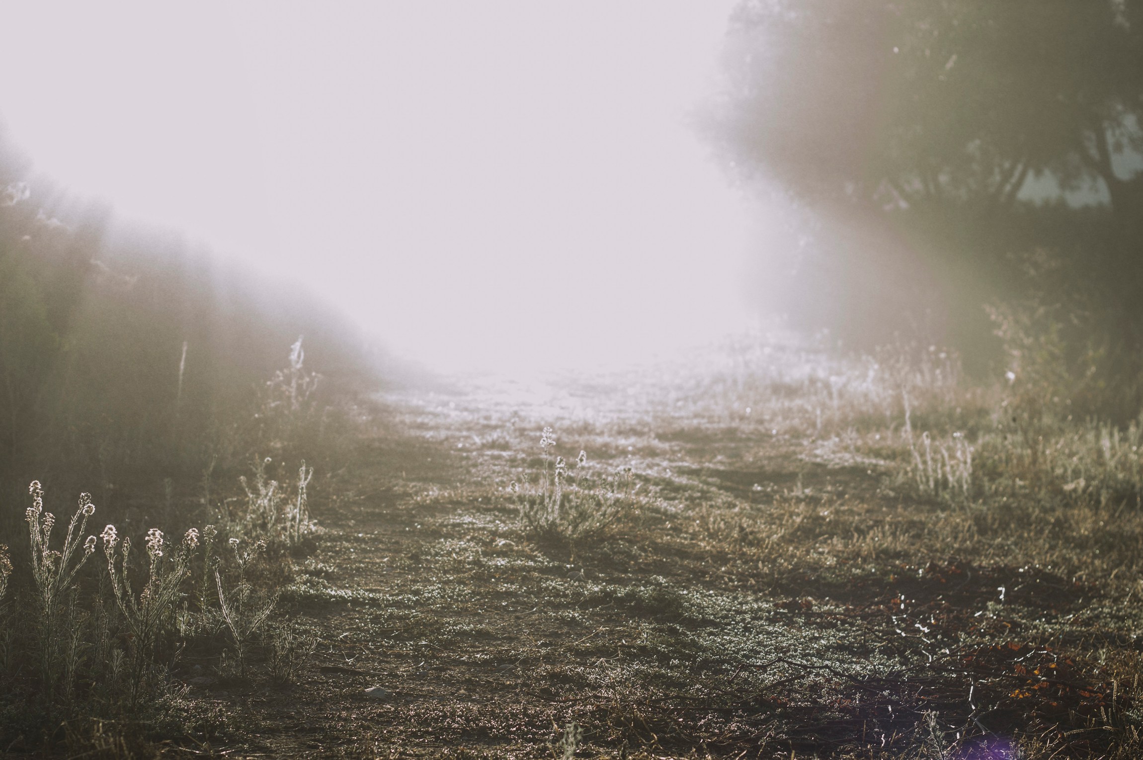
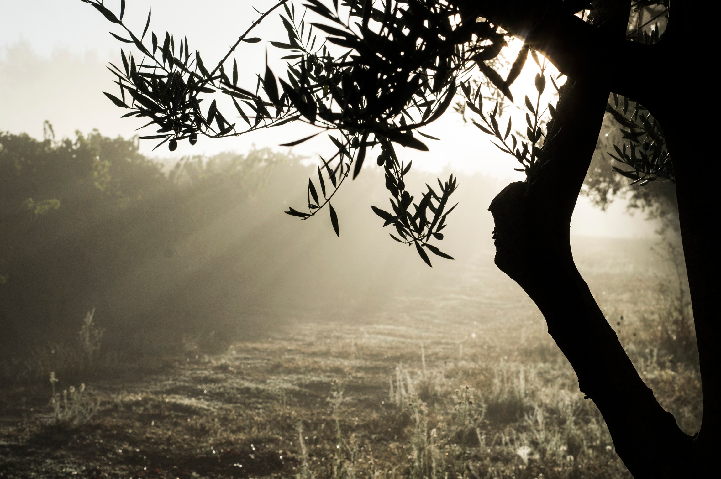
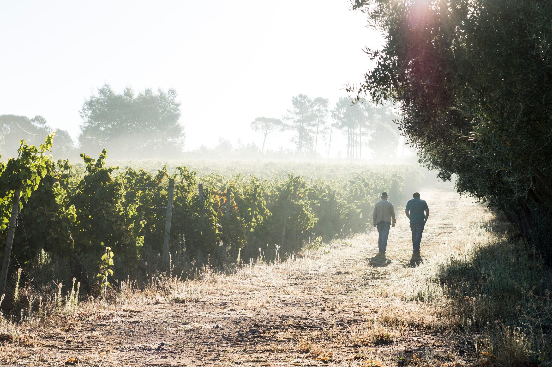
client name
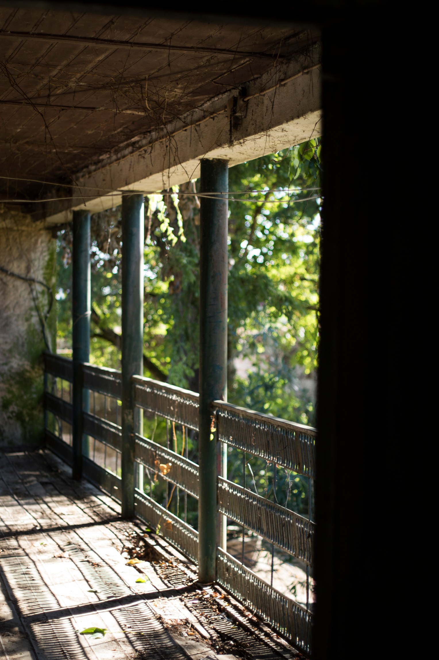
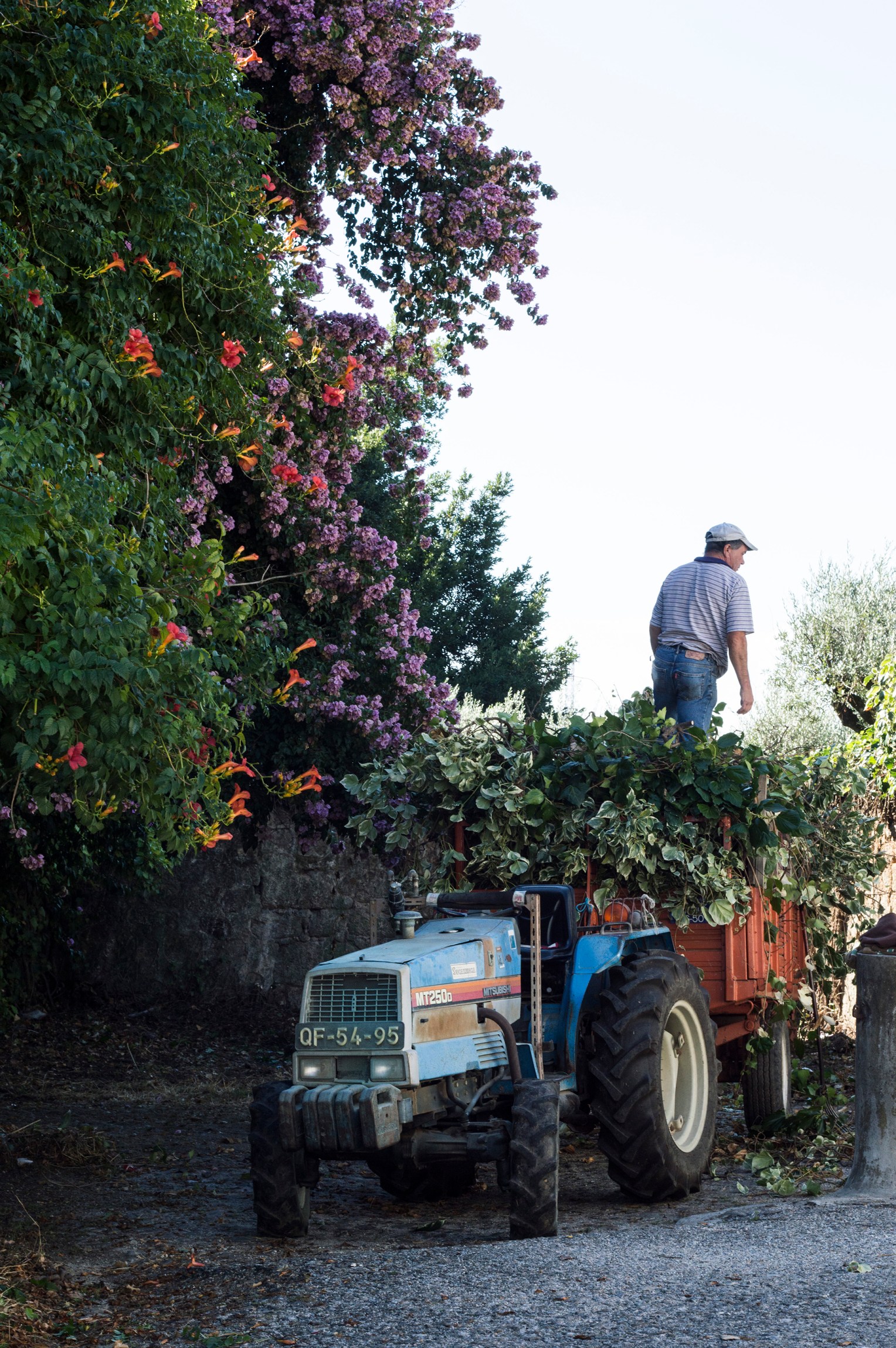
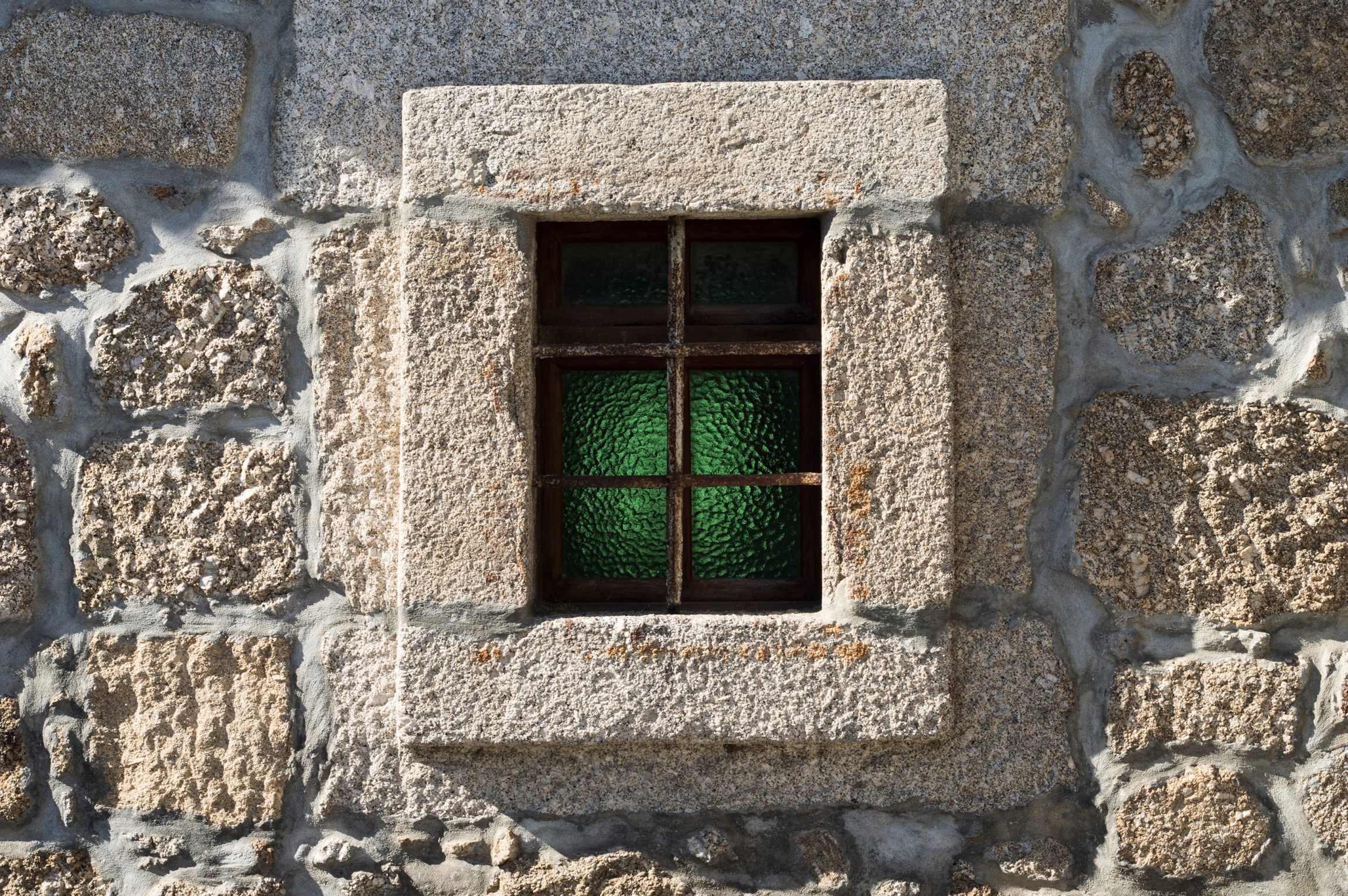
Chão de São Francisco
my role
photography
the objective
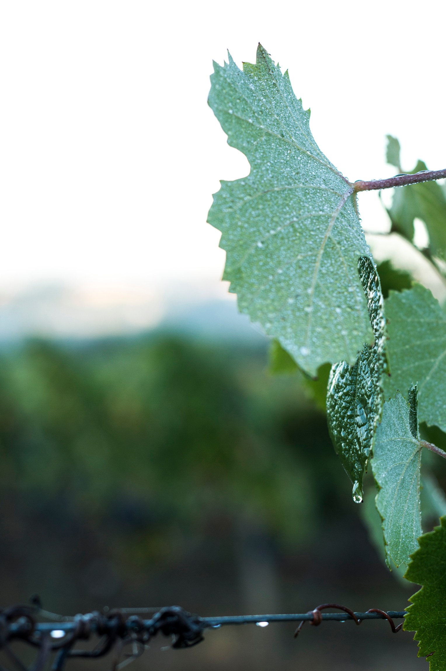
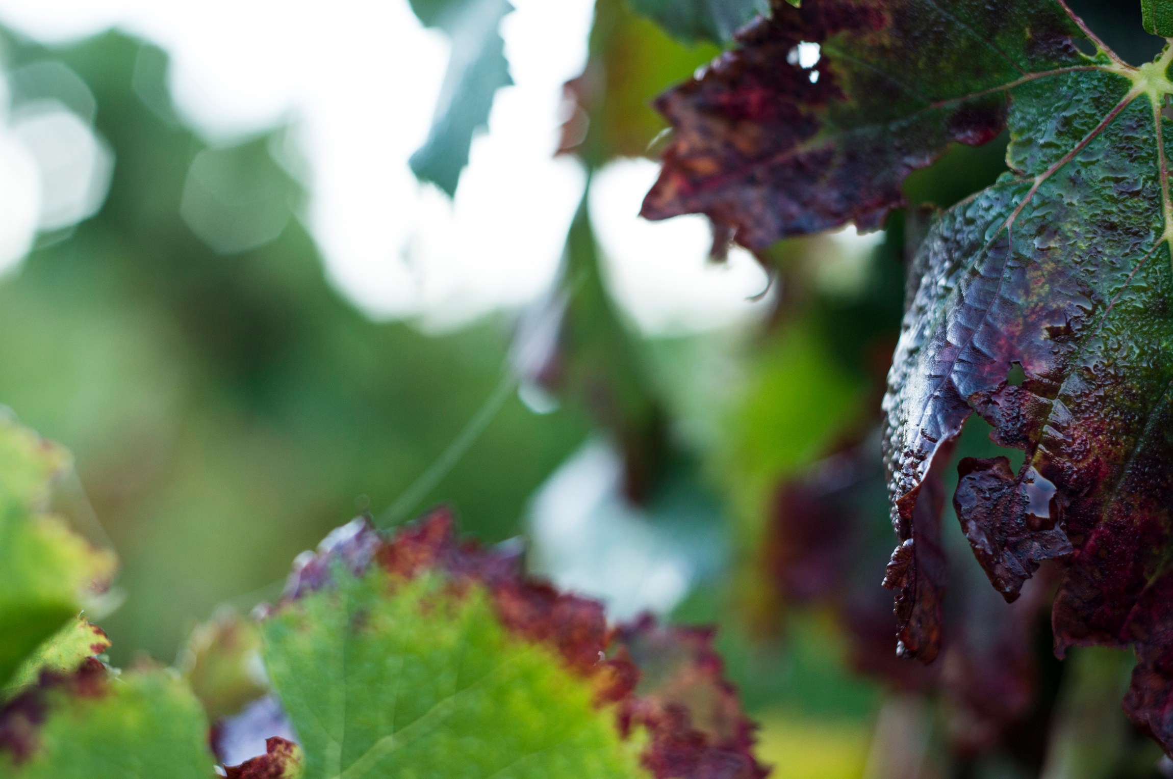
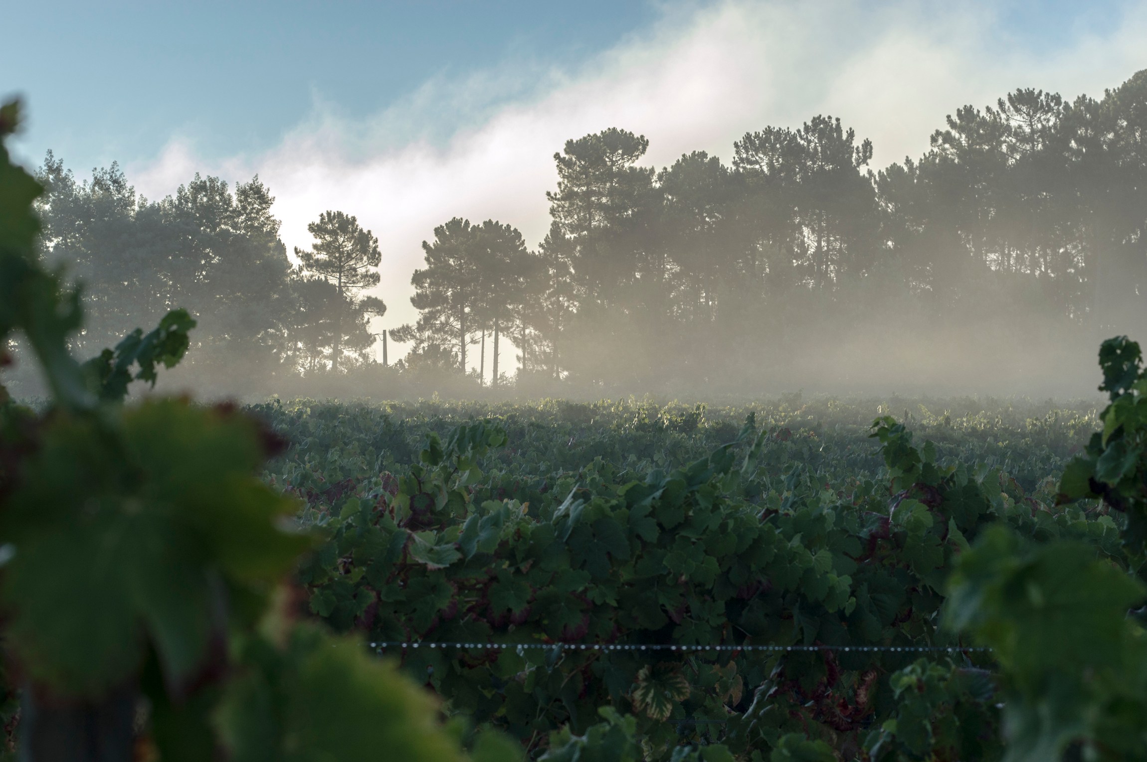
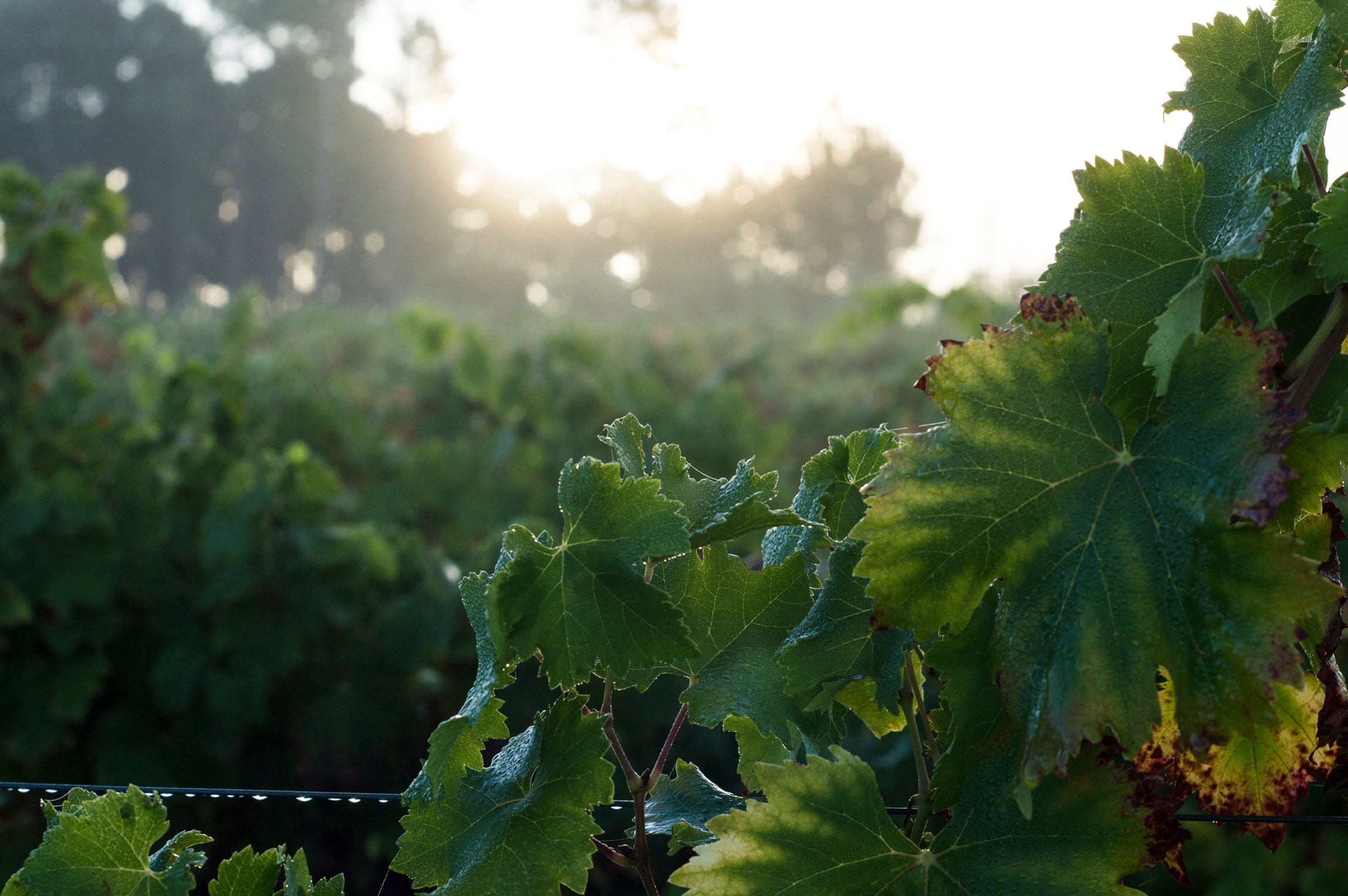
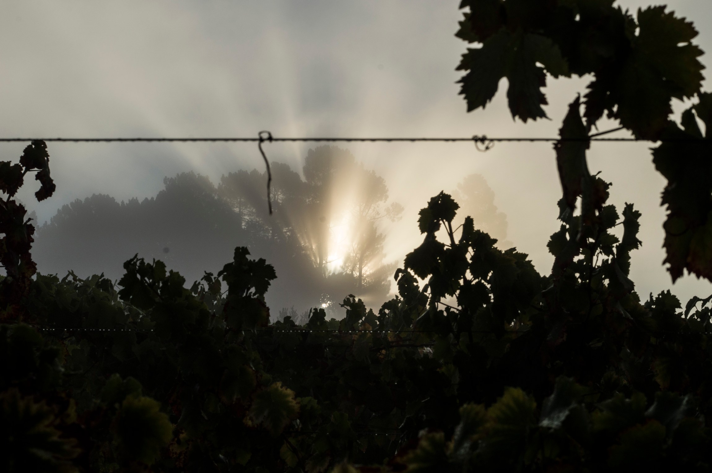
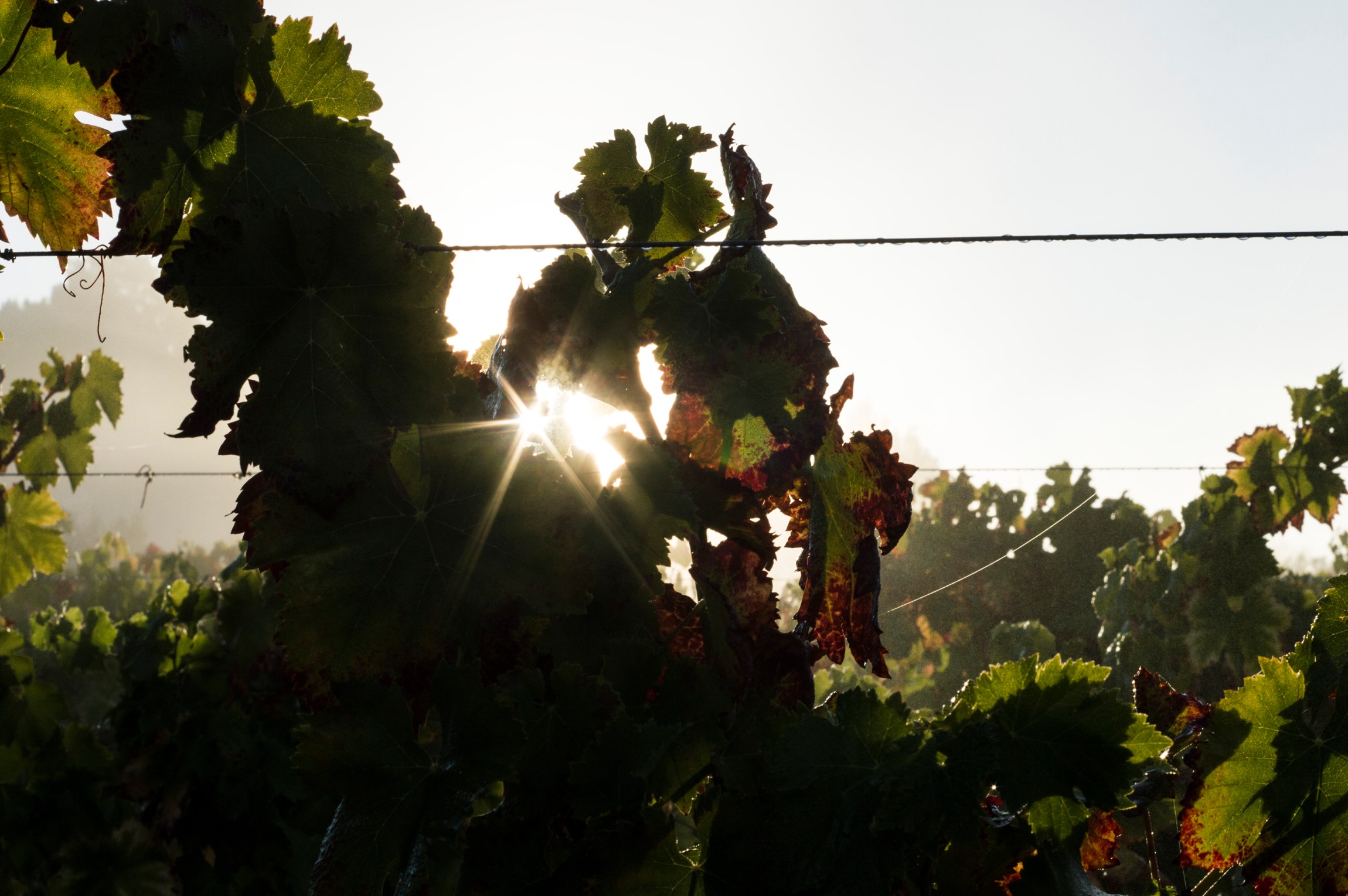
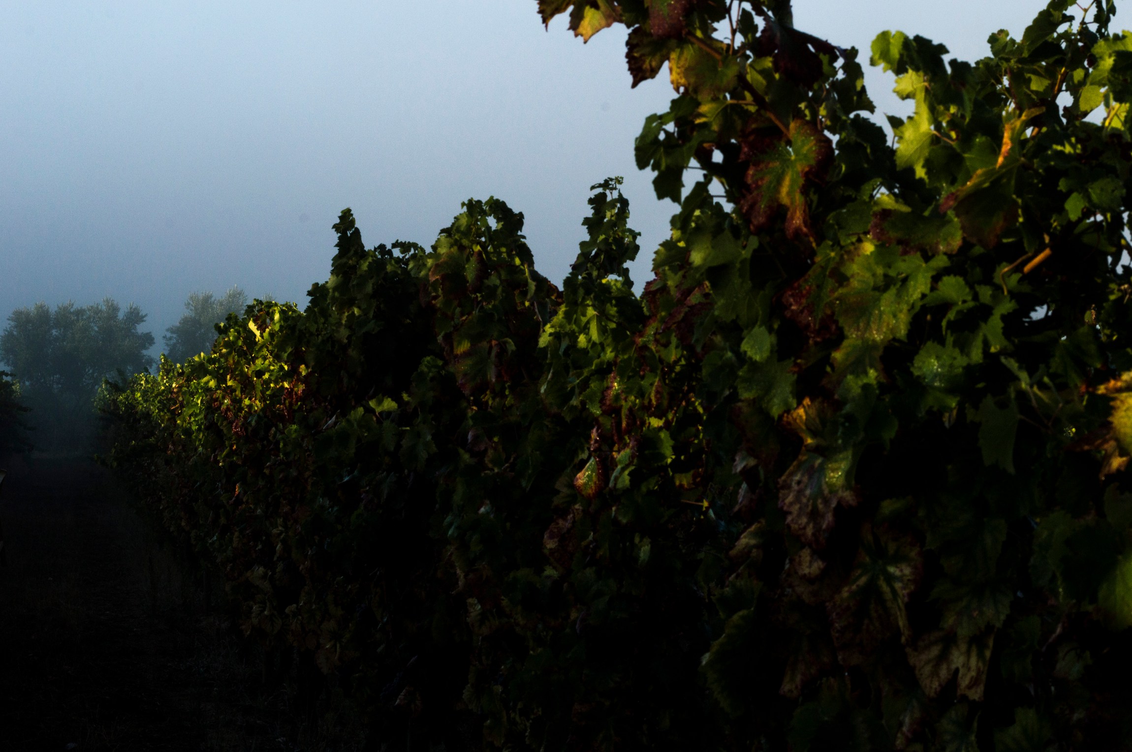
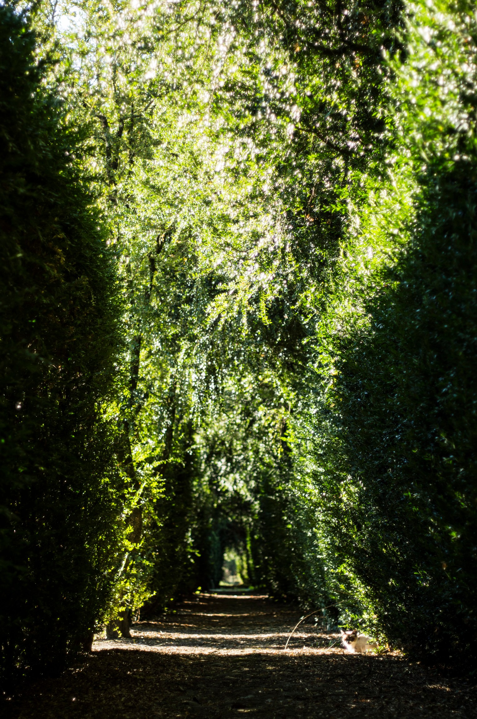
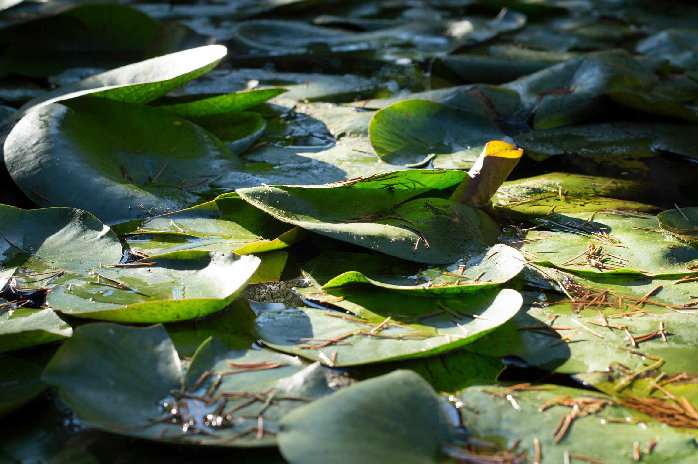
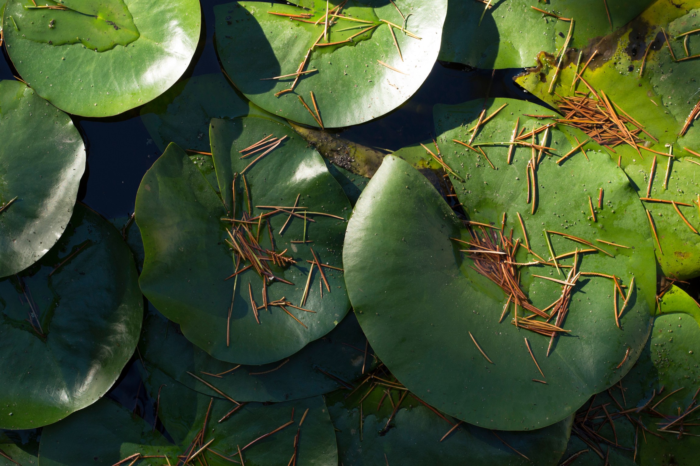
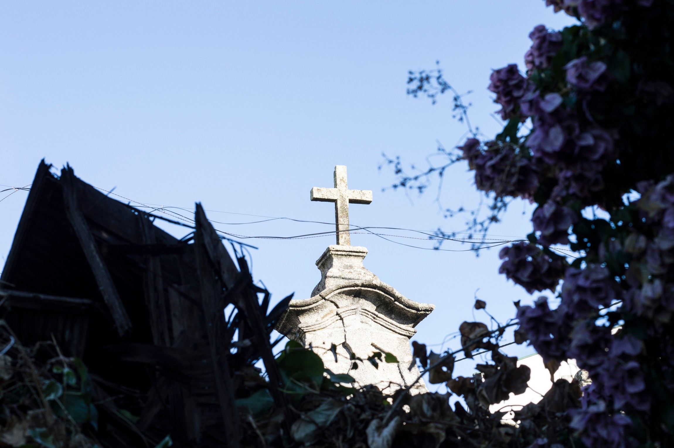
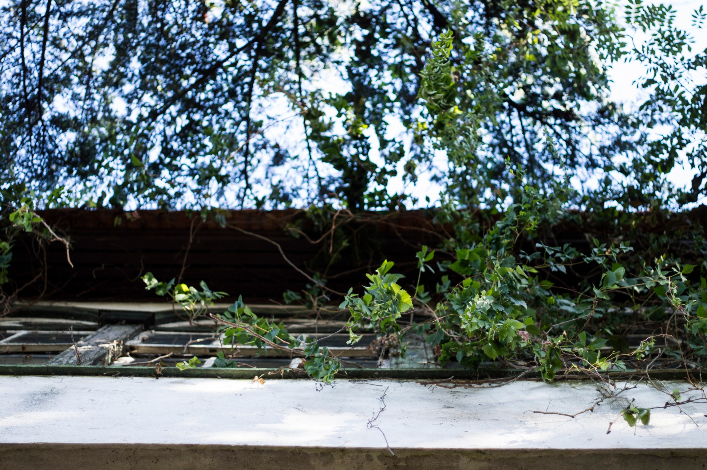
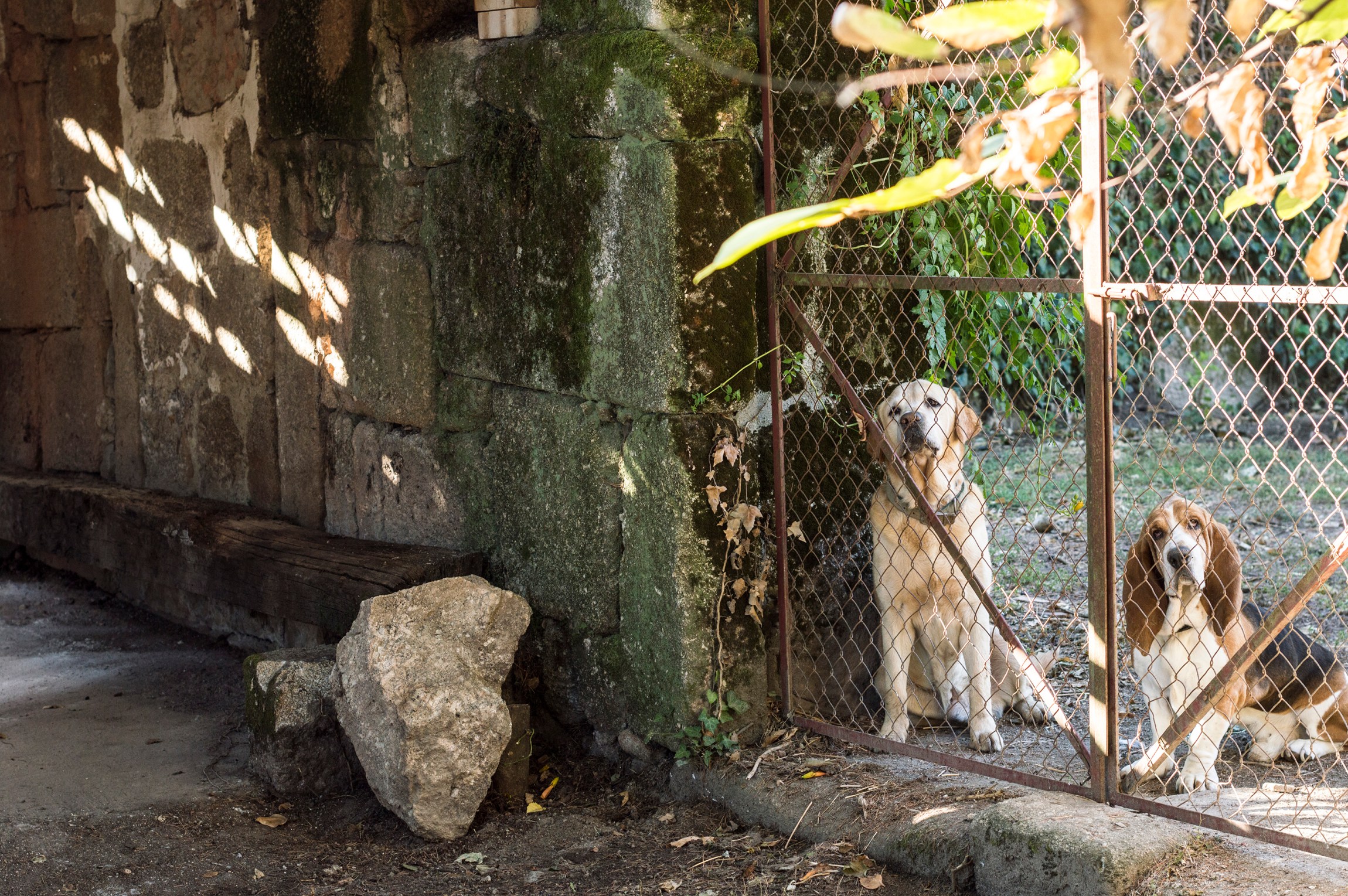
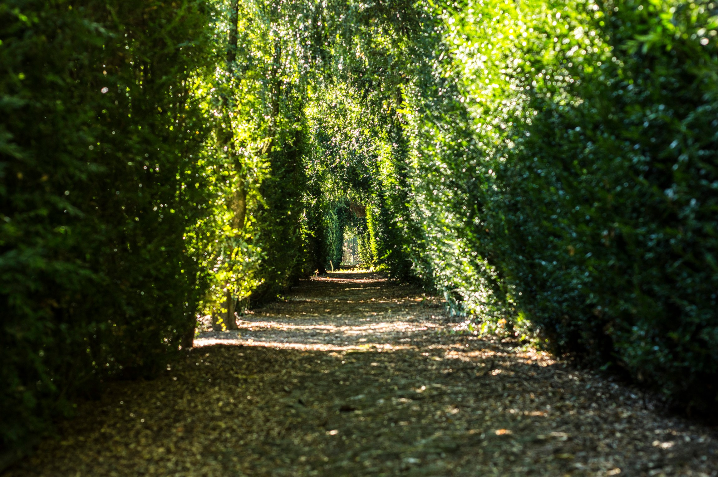
This wine estate is being remodelled by the new heirs. They wanted photographs of the property to use in conventions and other sorts of events.

printing . photography
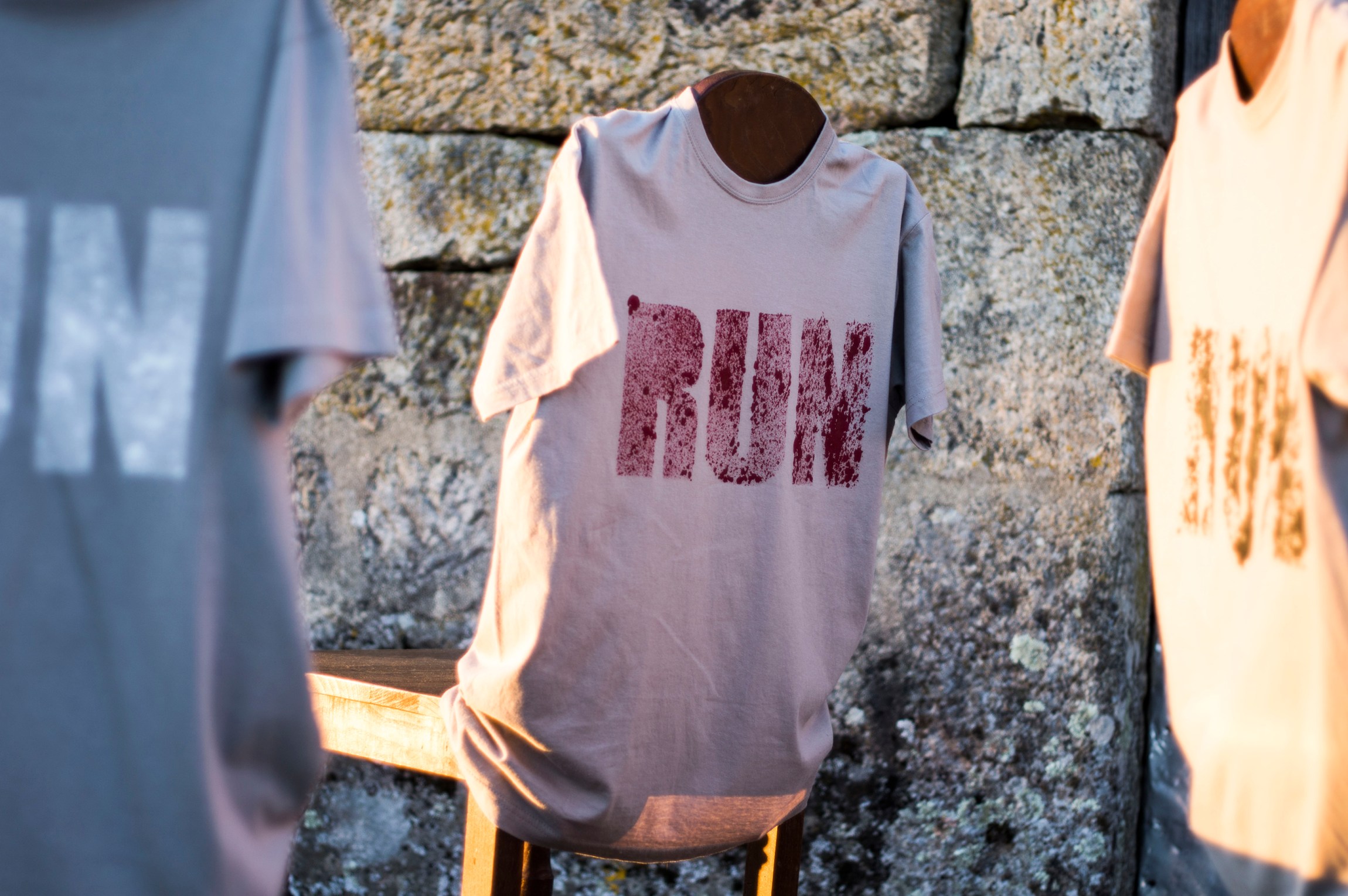
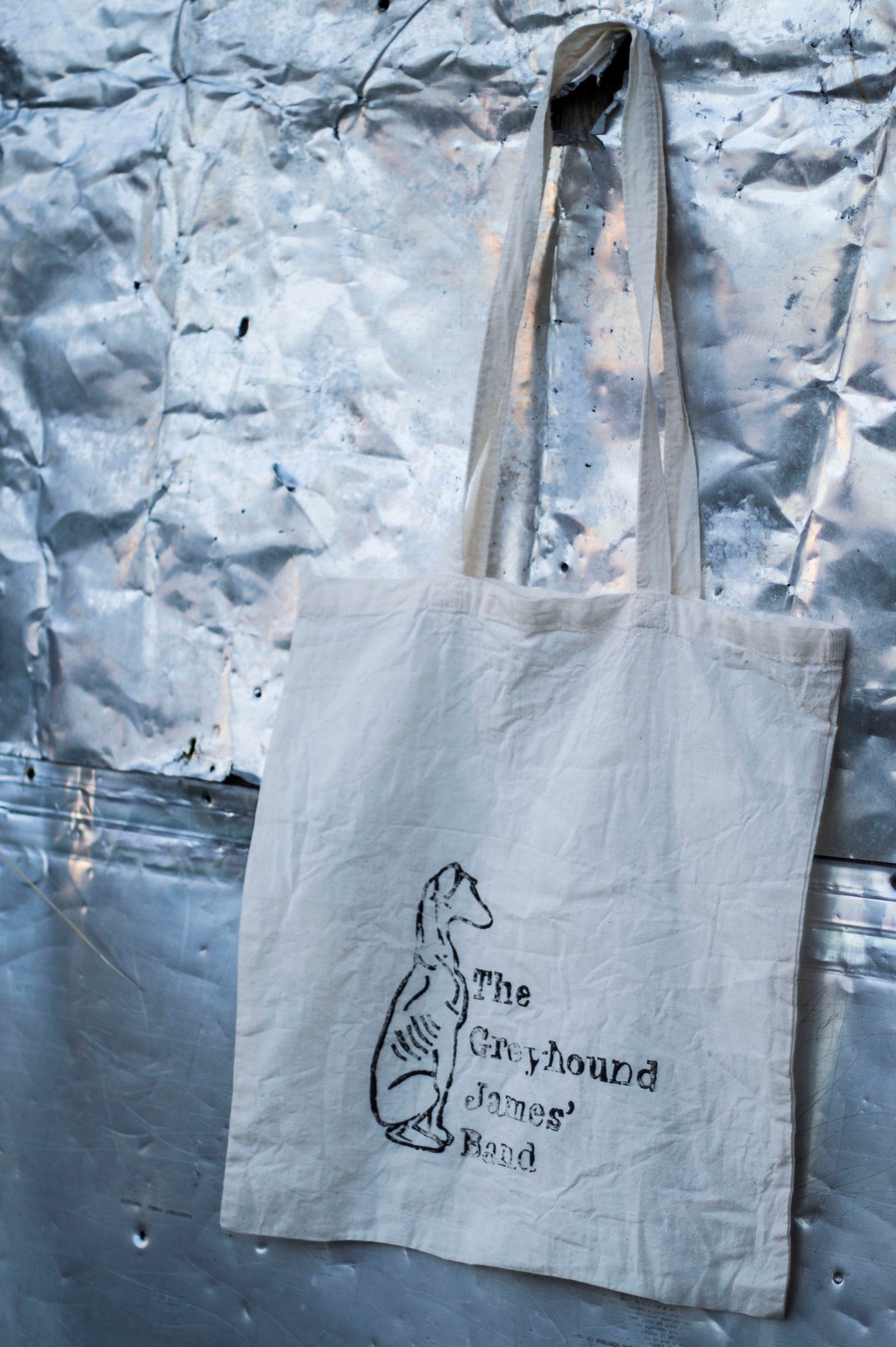
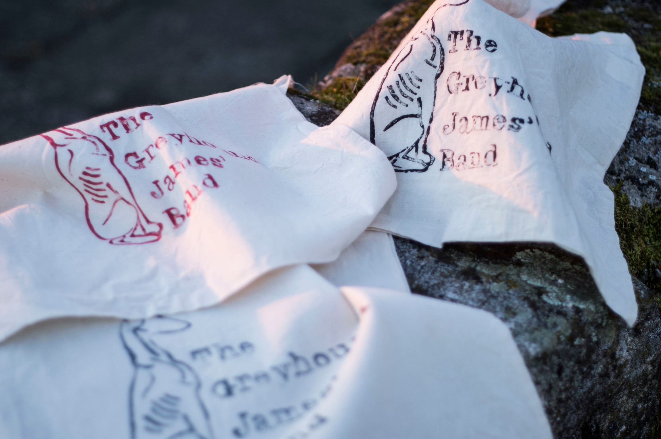
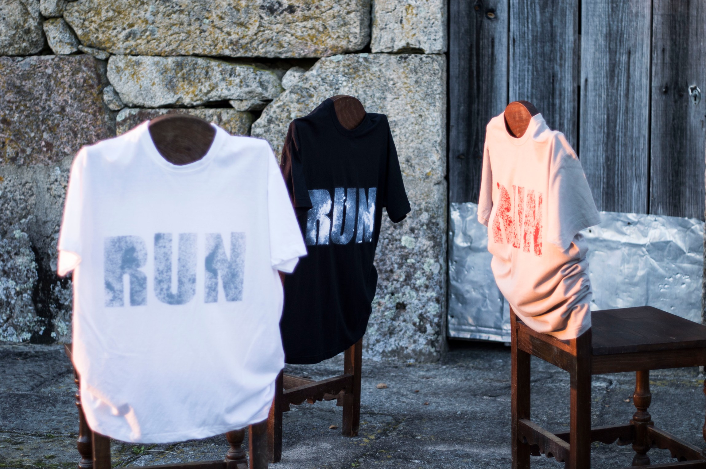
client name
The Greyhound James’ Band
my role
concept . design . photography . production . printing . art director
the objective
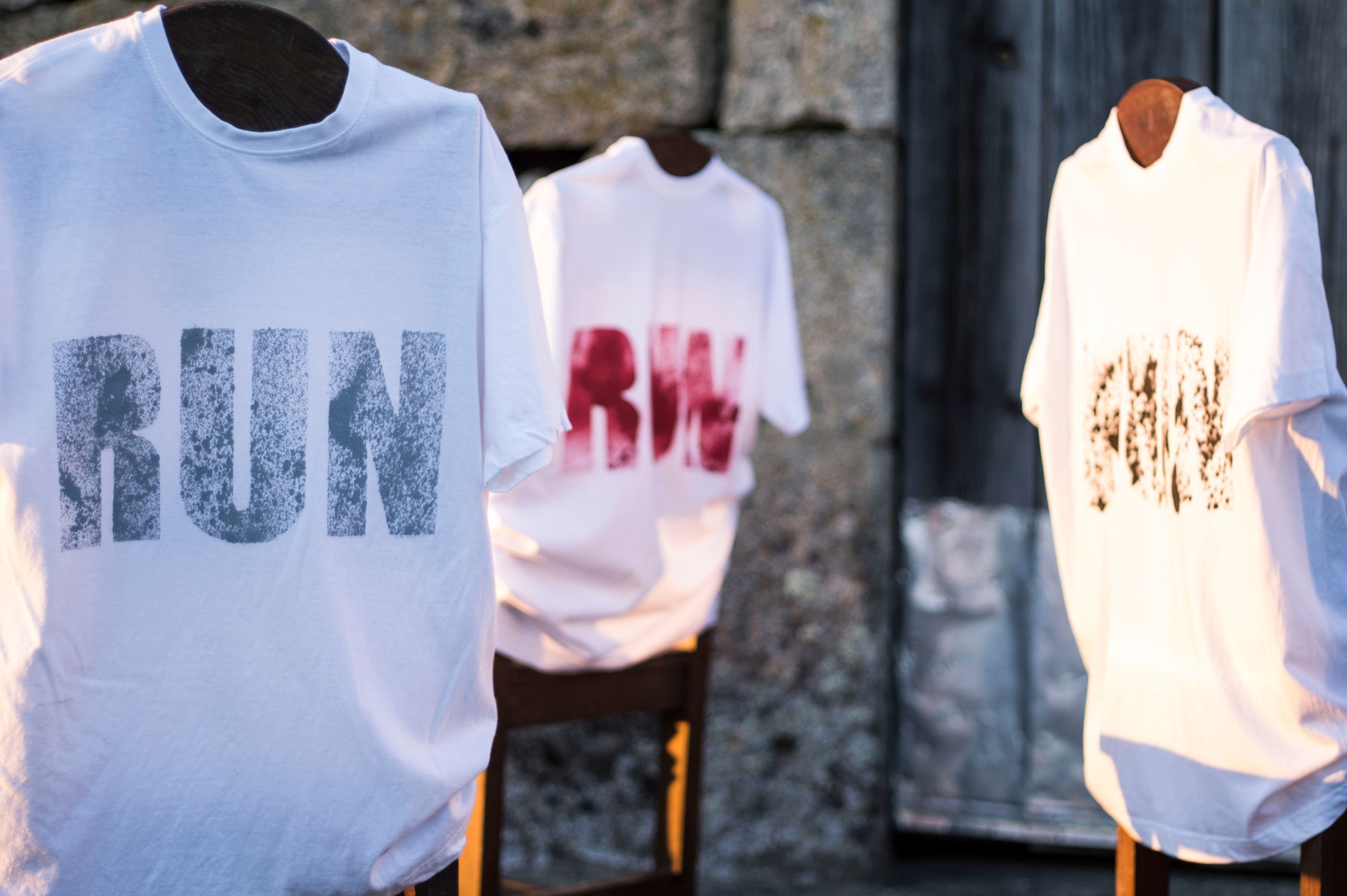
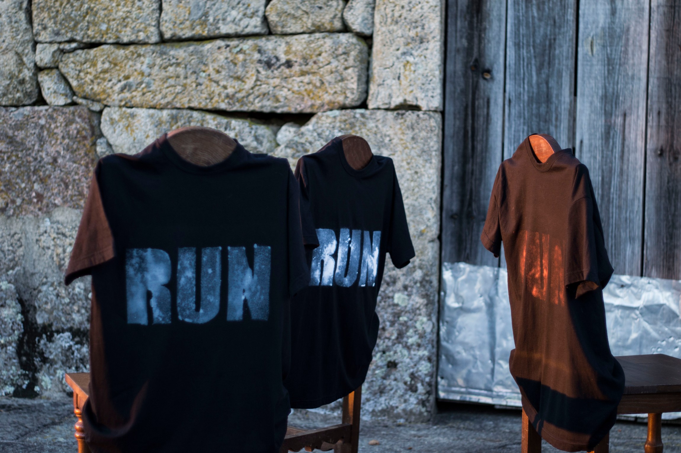
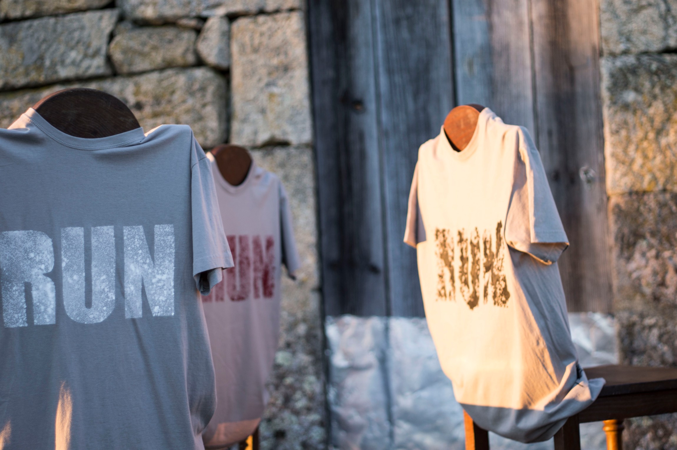
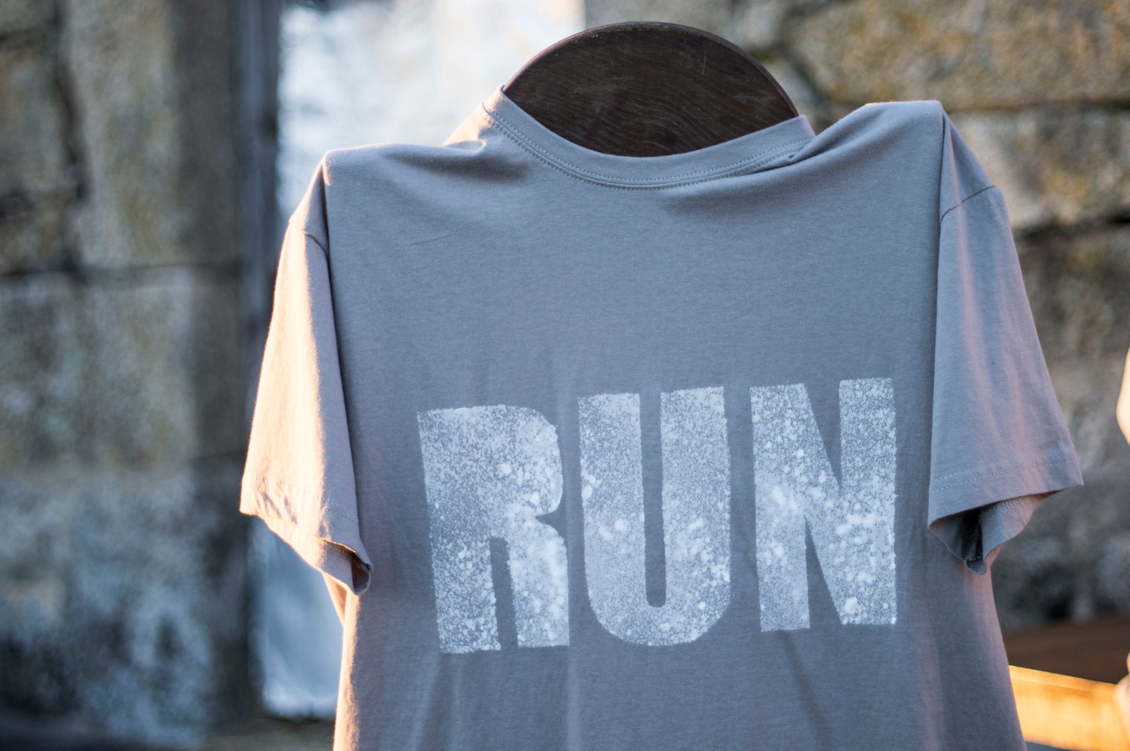
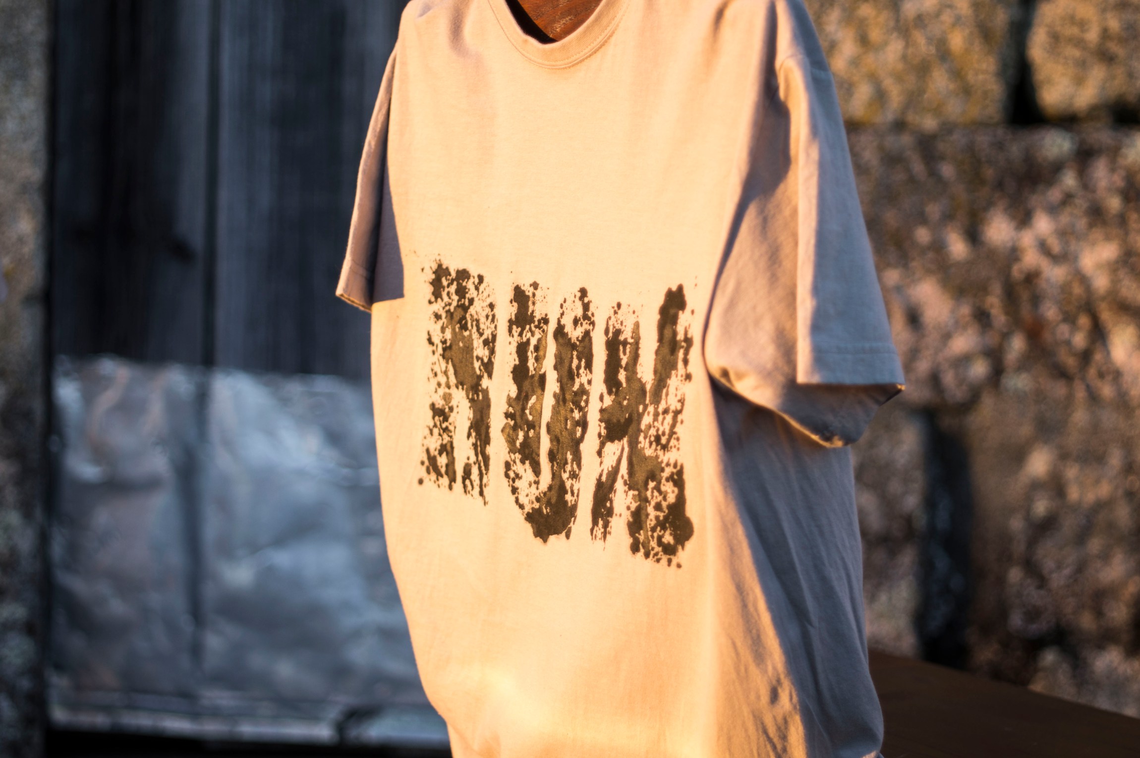
Tee shirts and cotton tote bags. Greyhound James wanted to use the word ”RUN” on front, allusive to the breed.
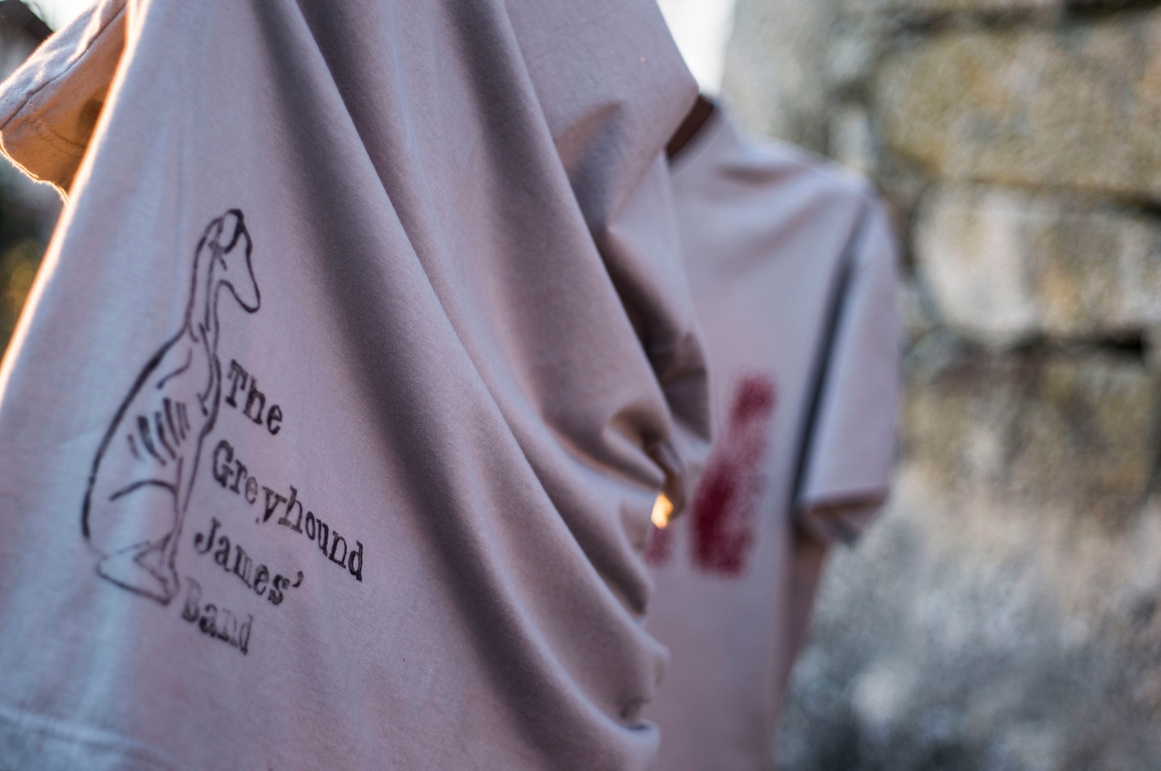
I made several stencils and then painted with fabric paint. The logo was printed with a linoleum previously carved.
The items were then placed on 3 chairs and finally photographed.
album artwork
client name
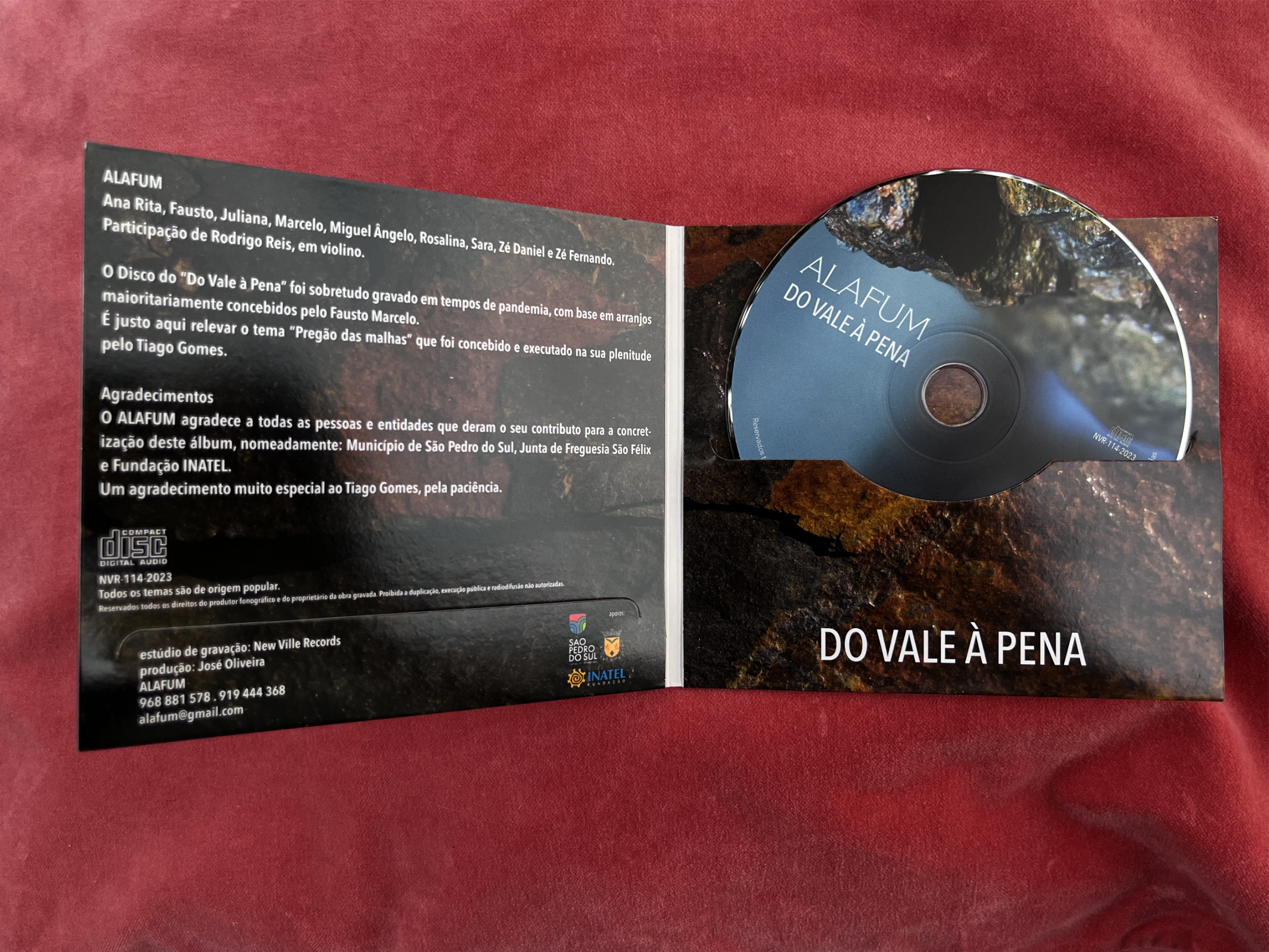
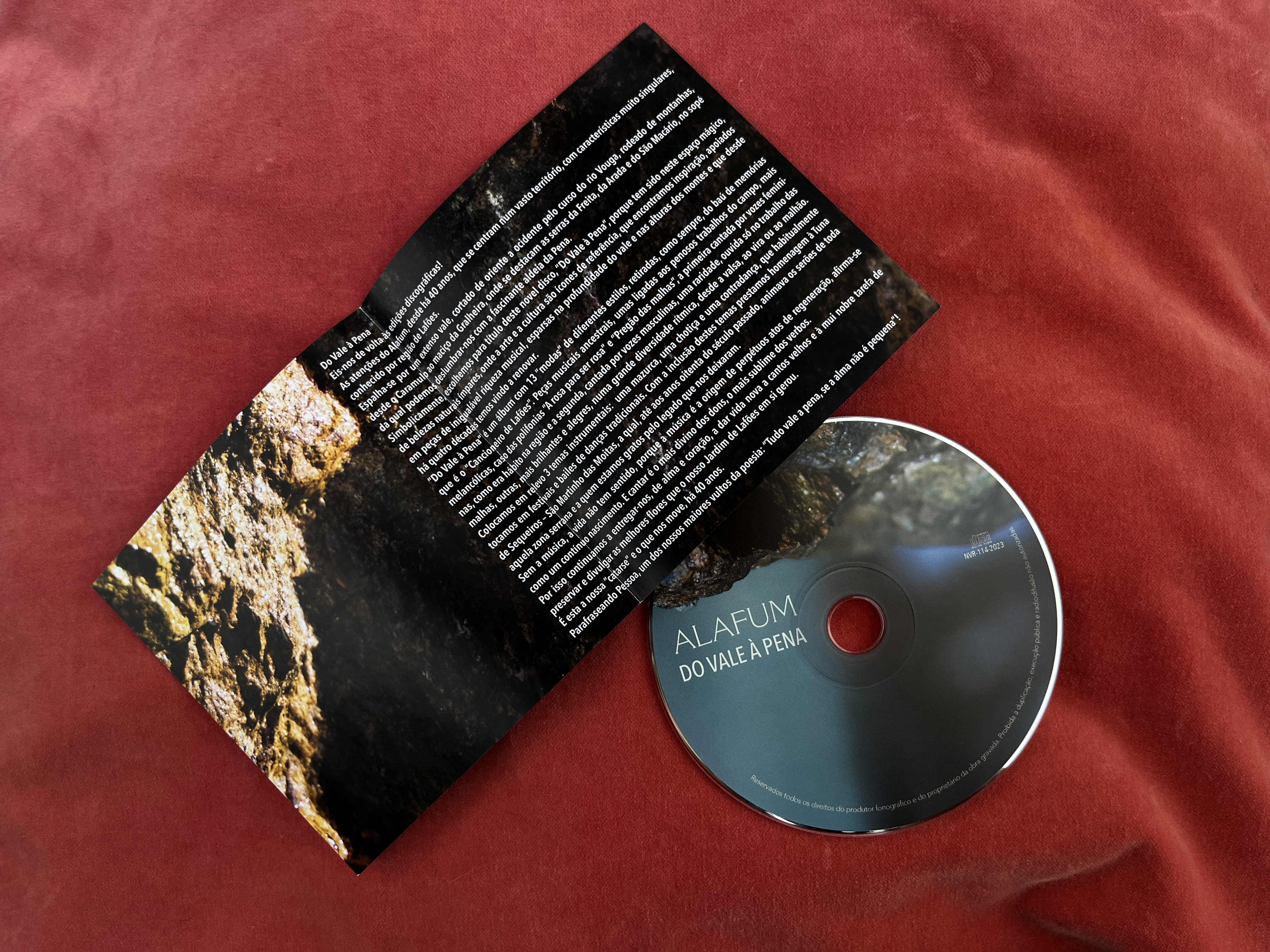
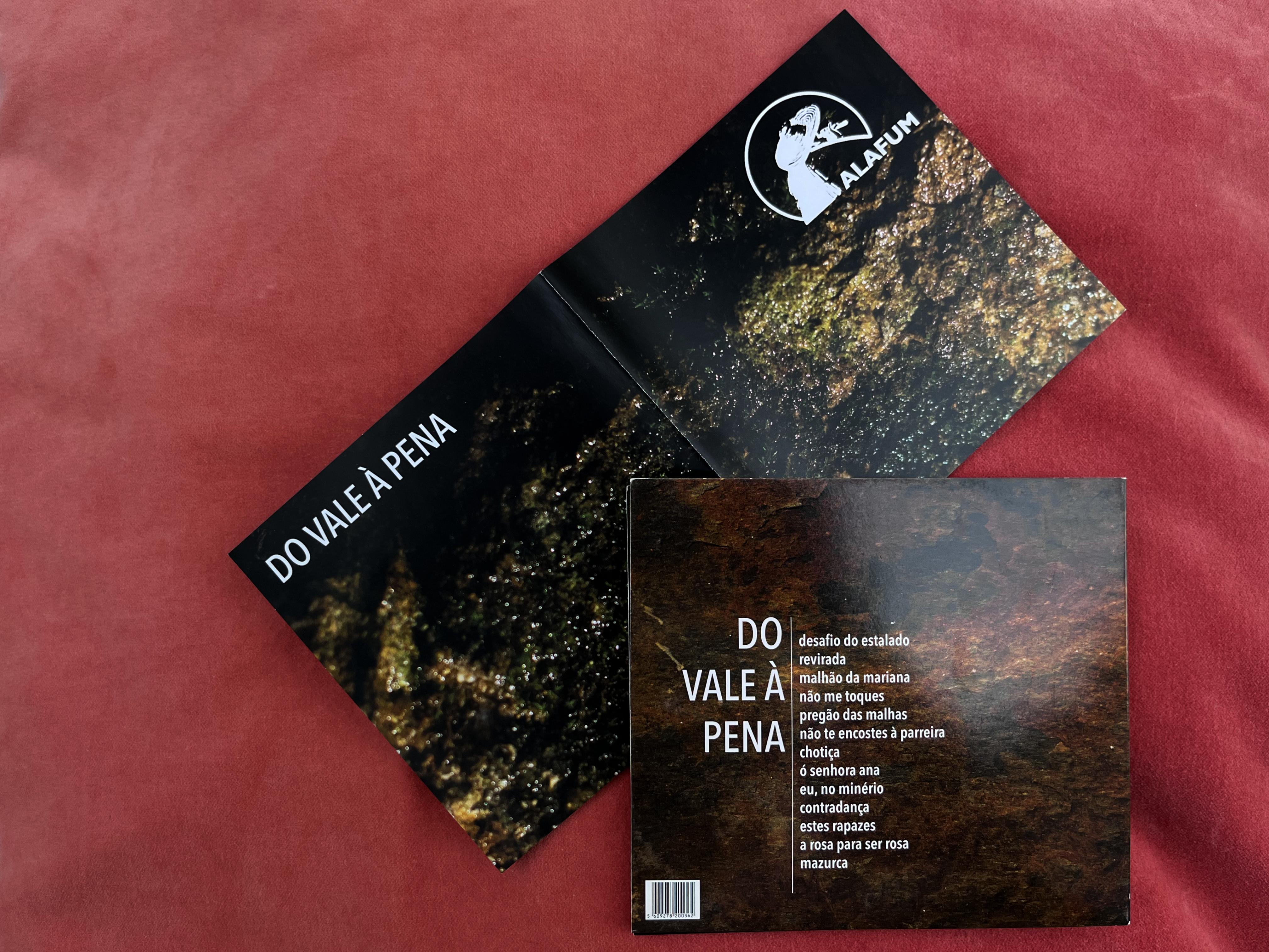
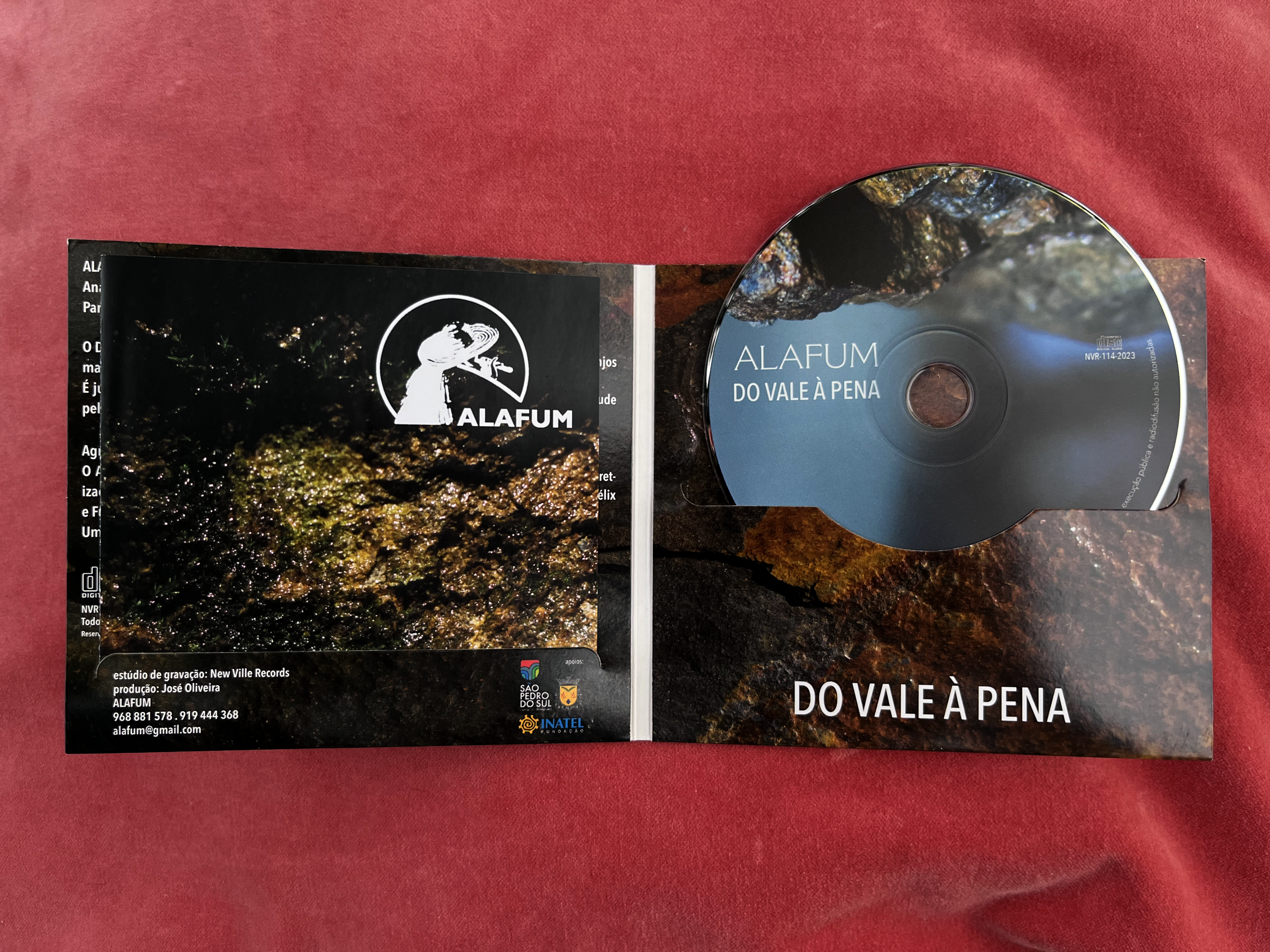
ALAFUM
my role
concept . design . photography . art director
the objective
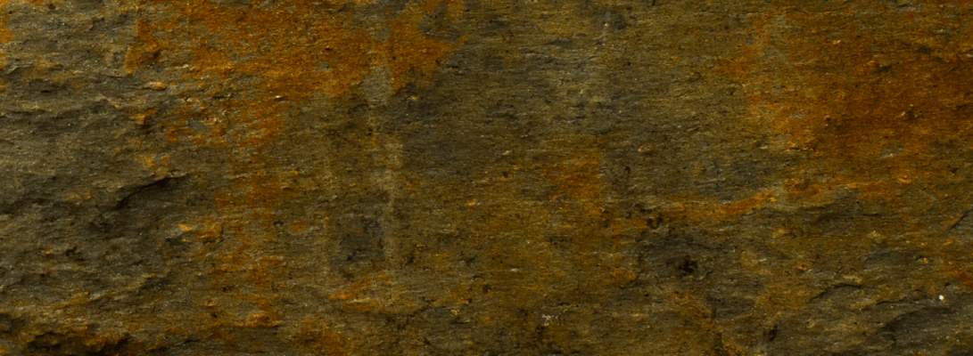
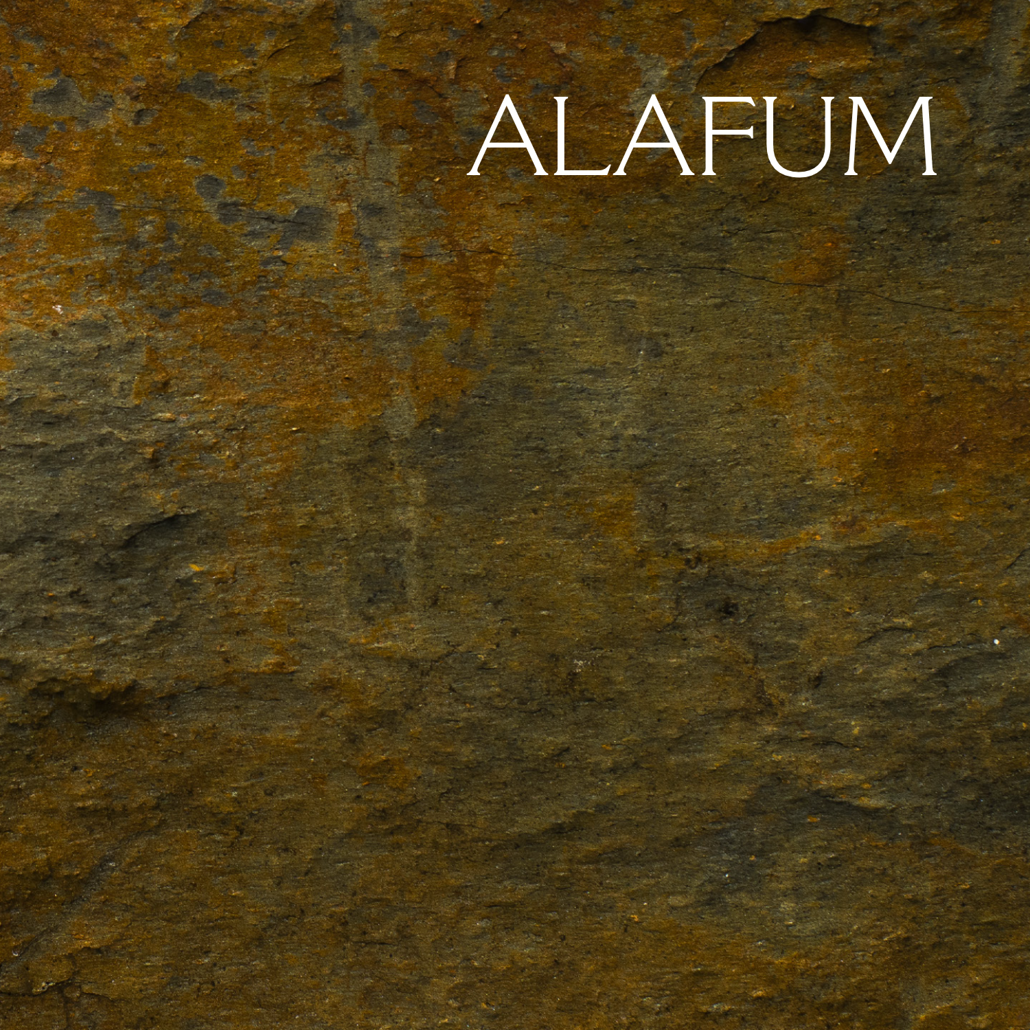
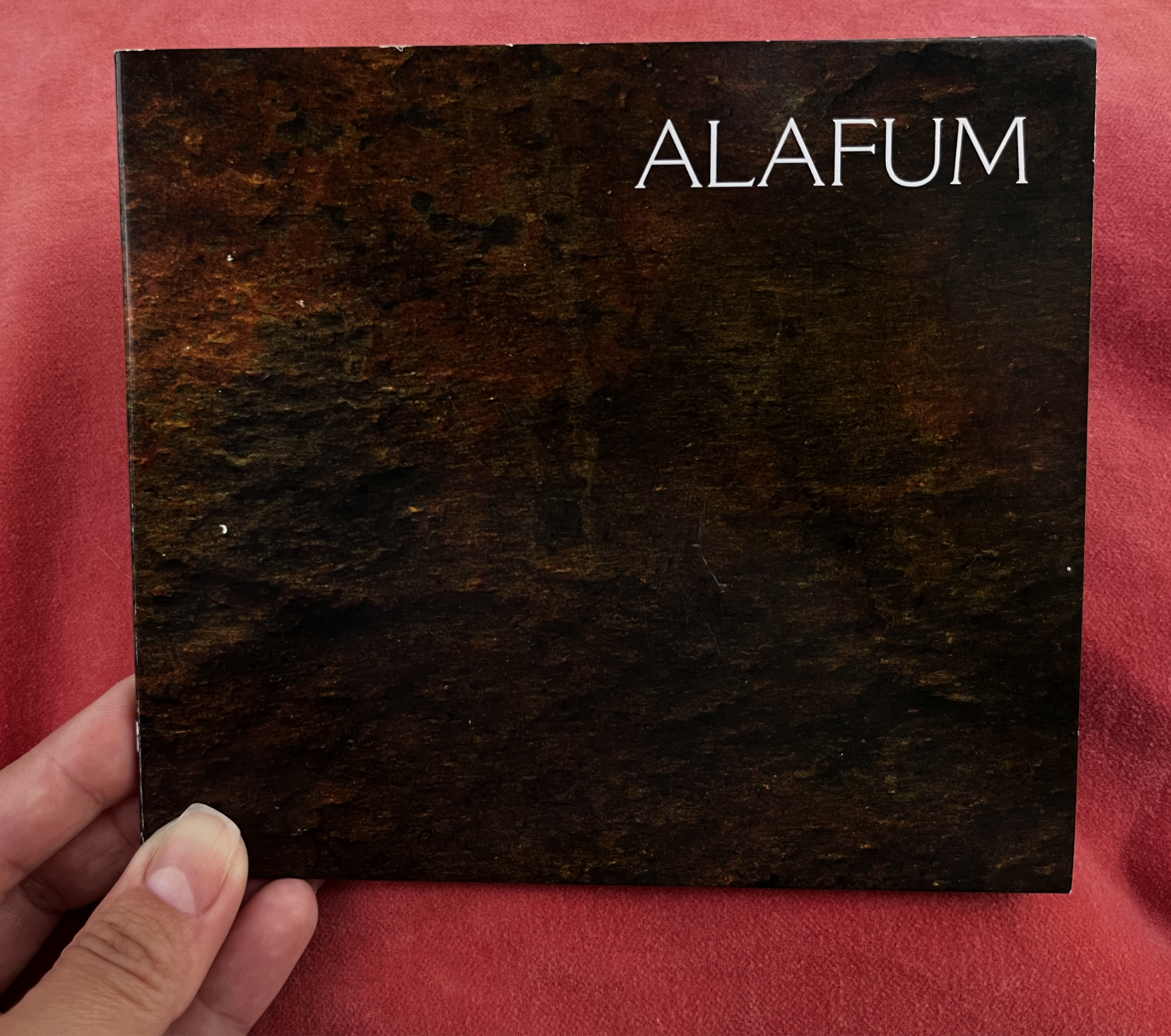
ALAFUM is a traditional portuguese music group with over 40 years old. The main theme on this album, their tenth one, was based on the richness and variety of the land where this music was born.
I wanted to explore that geographical detail, being the name of the album also a nod to this diversity.
Thus my playing with the scale and texture of some stones, that I managed to scout from said locations, paying homage to that geographical heterogeneous mixture.

poster


client name
União das freguesias de Carvalhais e Candal
my role
photography . graphic design . production
the objective
We’re talking about a region full of potencial, with gastronomy being the main attraction. The client approach me wanting something simple and honest, to promote the products made by the farmers. I photographed outdoors and design the posters, that were then advertised on MUPI.
credits
The farmers and the cook really went out of their way to make the products as yummy as they look.

